

티스토리 뷰
반응형
import matplotlib.pyplot as plt
import seaborn as sns

ante=sns.load_dataset('anscombe')
ante
df1=ante[ante['dataset']=='I']
df2=ante[ante['dataset']=='II']
df3=ante[ante['dataset']=='III']
df4=ante[ante['dataset']=='IV']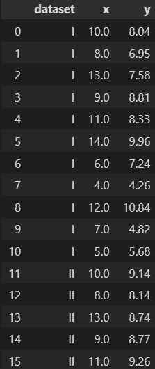
#통계치 확인
df1.describe()

df1, df2, df3, df4의 통계값은 다 같다.
#시각화하기
plt.plot(df1['x'],df1['y'],'o')
#시각화하기
plt.plot(df1['x'],df1['y'],'o')
plt.plot(df2['x'],df2['y'],'o')
plt.plot(df3['x'],df3['y'],'o')
plt.plot(df4['x'],df4['y'],'o')
헷갈린다.
서브플롯 그려보기
plt.figure(figsize=(9,6))
plt.subplot(221)
plt.subplot(222)
plt.subplot(223)
plt.subplot(224)
plt.figure(figsize=(9,6))
plt.subplot(221)
plt.plot(df1['x'],df1['y'],'o')
plt.subplot(222)
plt.plot(df2['x'],df2['y'],'o')
plt.subplot(223)
plt.plot(df3['x'],df3['y'],'o')
plt.subplot(224)
plt.plot(df4['x'],df4['y'],'o')
전체 그래프의 속성 지정
plt.figure(figsize=(9,6))
plt.subplot(221)
plt.plot(df1['x'],df1['y'],'o')
plt.title('ax1')
plt.subplot(222)
plt.plot(df2['x'],df2['y'],'o')
plt.title('ax2')
plt.subplot(223)
plt.plot(df3['x'],df3['y'],'o')
plt.title('ax3')
plt.subplot(224)
plt.plot(df4['x'],df4['y'],'o')
plt.title('ax4')
전체 제목 붙이기
fig=plt.figure(figsize=(9,6))
plt.subplot(221)
plt.plot(df1['x'],df1['y'],'o')
plt.title('ax1')
plt.subplot(222)
plt.plot(df2['x'],df2['y'],'o')
plt.title('ax2')
plt.subplot(223)
plt.plot(df3['x'],df3['y'],'o')
plt.title('ax3')
plt.subplot(224)
plt.plot(df4['x'],df4['y'],'o')
plt.title('ax4')

fig.suptitle('Amscome',size=20)
fig.tight_layout()
보기좋게 설정해줌
fig=plt.figure(figsize=(가로길이, 세로길이))
ax1=fig.add_axes([left,bottom,width,height])
ax1.plot(x,y)
ax1.set_title(제목)
fig=plt.figure(figsize=(8,6))

ax1=fig.add_axes([0,0.5,0.4,0.4])
ax2=fig.add_axes([0.5,0.5,0.4,0.4])
ax3=fig.add_axes([0,0,0.4,0.4])
ax4=fig.add_axes([0.5,0,0.4,0.4])

ax1.plot(df1['x'],df1['y'],'o')
ax2.plot(df2['x'],df2['y'],'r^')
ax3.plot(df3['x'],df3['y'],'k*')
ax4.plot(df4['x'],df4['y'],'m+')

ax1.set_title('ax1')
ax2.set_title('ax2')
ax3.set_title('ax3')
ax4.set_title('ax4')
plt.subplot()을 호출하면 figure과 axes 객체를 생성하여 튜플형태로 반환함.
fig,ax=plt.subplots(nrows=2,ncols=2,figsize=(8,6),sharex=True,sharey=True)

ax[0][0].plot(df1['x'],df1['y'],'o')
ax[0][1].plot(df2['x'],df2['y'],'r^')
ax[1][0].plot(df3['x'],df3['y'],'k*')
ax[1][1].plot(df4['x'],df4['y'],'m+')

#그리드 추가
ax[0][0].grid(ls=':')
ax[0][1].grid(ls=':',color='pink')
ax[1][0].grid(ls=':',color='skyblue')
ax[1][1].grid(ls=':',color='green',alpha=0.5)

#그래퍼 전체제목
fig.suptitle('Anscobe',size=20)
fig=plt.figure(figsize=(9,6),facecolor='ivory')

ax1=fig.add_subplot(2,2,1)
ax2=fig.add_subplot(2,2,2,sharex=ax1,sharey=ax1)
ax3=fig.add_subplot(2,2,3,sharex=ax1,sharey=ax1)
ax4=fig.add_subplot(2,2,4)

# 축 공유

ax1.plot(df1['x'],df1['y'],'o',label='ax1')
ax2.plot(df2['x'],df1['y'],'^',label='ax2')
ax3.plot(df3['x'],df1['y'],'*',label='ax3')
ax4.plot(df4['x'],df1['y'],'+',label='ax4')

#틱 변경하기
ax4.set_xticks(range(1,20,1))

#범례
ax1.legend(loc=2)
ax2.legend(loc=2)
ax3.legend(loc=2)
ax4.legend(loc=2)

fig.suptitle('Anscombe',size=20)

#크기 최적화
fig.tight_layout()

plt.show()
이미지 내보내기
fig.savefig('1mg100.png',dpi=150)반응형
'새싹 > 새싹 데이터시각화' 카테고리의 다른 글
| 7. 서울시 연간 기온변화 분석 및 시각화 (0) | 2022.07.29 |
|---|---|
| 6. seaborn-막대그래프 (0) | 2022.07.19 |
| 5. 그래프 스타일 고급 설정 (0) | 2022.07.15 |
| 4. 데이터의 분포와 비율을 파악하기 위한 그래프 (1) | 2022.07.12 |
| 1강 그래프 스타일링 (0) | 2022.07.07 |
공지사항
최근에 올라온 글
최근에 달린 댓글
- Total
- Today
- Yesterday
링크
TAG
- c++
- Python
- 데이터분석
- 여인권
- 오블완
- EBS
- K-MOOC
- stl
- 통계학
- 류근관
- 티스토리챌린지
- 인지부조화
- C/C++
- 일본어문법무작정따라하기
- jlpt
- 일본어
- 코딩테스트
- 백준
- 회계
- 보세사
- 심리학
- 윤성우
- 사회심리학
- 파이썬
- 열혈프로그래밍
- 통계
- 뇌와행동의기초
- 일문따
- 인프런
- C
| 일 | 월 | 화 | 수 | 목 | 금 | 토 |
|---|---|---|---|---|---|---|
| 1 | 2 | 3 | 4 | 5 | ||
| 6 | 7 | 8 | 9 | 10 | 11 | 12 |
| 13 | 14 | 15 | 16 | 17 | 18 | 19 |
| 20 | 21 | 22 | 23 | 24 | 25 | 26 |
| 27 | 28 | 29 | 30 |
글 보관함
반응형