

티스토리 뷰
히스토그램
scores=[0,10,15,15,16,19,20,21,25,25,26,26,29,30,35,36,37,39,40,41,41,44,45,45,45,45,47
,50,50,50,51,51,51,53,54,55,55,56,60,61,62,63,64,65,65,66,66,66,66,67
,68,68,69,70,70,70,70,70,70,70,71,71,71,71,72,72,72,72,74,74,74,75,75
,76,76,76,77,77,77,78,78,78,78,79,79,79,80,80,80,80,80,81,81,82,82
,85,85,85,88,88,89,90,90,90,93,93,95,95,97,100]
plt.hist(scores)
bins=구간 개수
plt.hist(scores,bins=20)
누적 히스토그램
plt.hist(scores,bins=20,cumulative=True)
범위 지정
range=(min,max)
plt.hist(scores,bins=20,range=(50,90))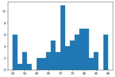
밀도 표현
density=Ture
도수를 총 개수로 나눈 수치를 y축에 표현
plt.hist(scores,density=True)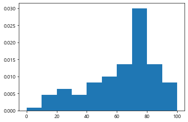
plt.hist(scores,density=True,orientation='horizontal')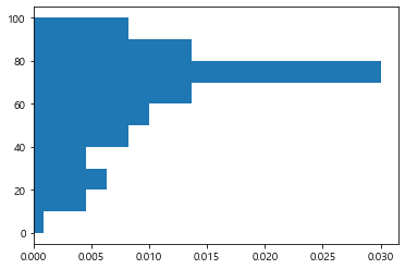
막대스타일
선만 표시 histtype='step'
plt.hist(scores,density=True,histtype='step')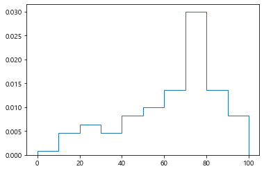
rwidth = 막대폭(0~1), color=막대색, alpha=투명도
edgeclor(ec)= 선색, linewidth(lw)=선두께, linestyle(ls)=선스타일,hatch=패턴
plt.hist(scores,rwidth=0.9,color='b',alpha=0.5,ec='k',lw=2,ls=':'
,hatch='/')
plt.xticks(range(0,101,10))
plt.grid(axis='y',ls=':')
plt.xlabel('점수')
plt.ylabel('인원')
plt.title('점수대별 인원 분포',size=20)
plt.show()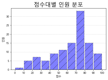
박스플롯
데이터로부터 얻어진 아래의 다섯 요약 수치를 사용해서 그린다.
최소값
제1사분위수
제2사분위수, 중위수
제3사분위수
최대값
import pandas as pd
scores=pd.Series([0,10,15,15,16,19,20,21,25,25,26,26,29,30,35,36,37,39,40,41,41,44,45,45,45,45,47
,50,50,50,51,51,51,53,54,55,55,56,60,61,62,63,64,65,65,66,66,66,66,67
,68,68,69,70,70,70,70,70,70,70,71,71,71,71,72,72,72,72,74,74,74,75,75
,76,76,76,77,77,77,78,78,78,78,79,79,79,80,80,80,80,80,81,81,82,82
,85,85,85,88,88,89,90,90,90,93,93,95,95,97,100])scores.describe()count 110.000000
mean 62.727273
std 22.202120
min 0.000000
25% 50.000000
50% 70.000000
75% 78.000000
max 100.000000
dtype: float64
이상치 구하기
Q1=scores.quantile(.25)

Q3=scores.quantile(.75)
plt.boxplot(scores)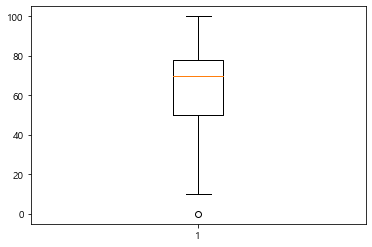
평균 표시하기
showmeans=True
meanline=True
plt.boxplot(scores,showmeans=True,meanline=True)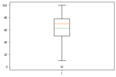
수평박스플롯
vert=False
plt.boxplot(scores,showmeans=True,meanline=True,vert=False)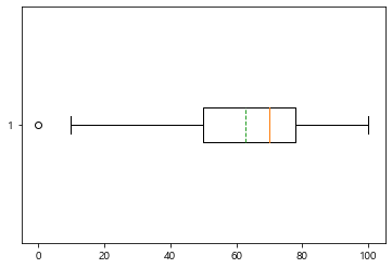
예제 데이터 가져오기
import seaborn as sns
iris = sns.load_dataset('iris')
iris.head()
plt.boxplot([iris['sepal_length'],iris['sepal_width'],iris['petal_length'],iris['petal_width']])
plt.show()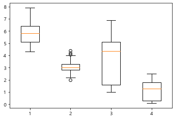
plt.boxplot([iris['sepal_length'],iris['sepal_width'],iris['petal_length'],iris['petal_width']]
,labels=['sepal_length','sepal_width','petal_length','petal_width'],
showmeans=True)
plt.grid(axis='y')
plt.show()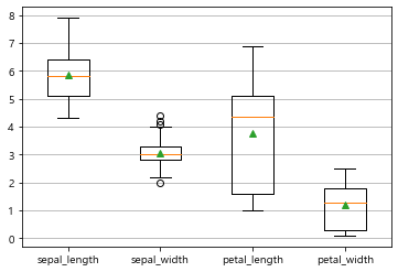
바이올린 플롯
plt.violinplot(scores)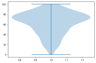
최대값, 최소값, 중간값 표시
showextream=True/False
showemeans=True/False
showeedians=True/False
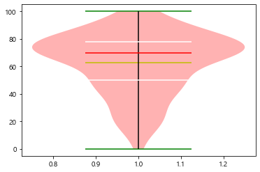
plt.violinplot(scores,showextrema=True,showmeans=True,showmedians=True,
quantiles=[0.25,0.75])
plt.show()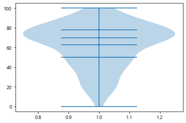
스타일로 지정하기
플롯['bodies'][인덱스].set_facecolor(컬러)
플롯['cmins'][인덱스].set_edgecolor(컬러)
플롯['cmaxes'][인덱스].set_edgecolor(컬러)
플롯['cbars'][인덱스].set_edgecolor(컬러)
플롯['cmedians'][인덱스].set_edgecolor(컬러)
플롯['cquantiles'][인덱스].set_edgecolor(컬러)
플롯['cmeans'][인덱스].set_edgecolor(컬러)
v1=plt.violinplot(scores,showextrema=True,showmeans=True,showmedians=True,
quantiles=[0.25,0.75])
v1['bodies'][0].set_facecolor('r')
v1['cmins'].set_edgecolor('g')
v1['cmaxes'].set_edgecolor('g')
v1['cbars'].set_edgecolor('k')
v1['cmedians'].set_edgecolor('r')
v1['cquantiles'].set_edgecolor('w')
v1['cmeans'].set_edgecolor('y')
plt.show()
iris=sns.load_dataset('iris')plt.violinplot([iris['sepal_length'],iris['sepal_width'],iris['petal_length'],iris['petal_width']])
plt.show()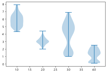
plt.violinplot([iris['sepal_length'],iris['sepal_width'],iris['petal_length'],iris['petal_width']])
plt.xticks(range(1,5,1),labels=['sepal_length','sepal_width','petal_length','petal_width'])
plt.show()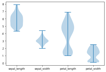
파이 그래프
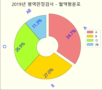
blood_type=['A','B','O','AB']
personal=[111901,87066,86804,36495]
plt.pie(personal)
plt.show()
plt.pie(personal,labels=blood_type)
plt.show()
plt.pie(personal,labels=blood_type,labeldistance=1.2)
plt.show()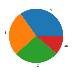
비율표시하기
autopct ='%소수점자리수%%'
pctdistance=중심점에서의 거리
plt.pie(personal,labels=blood_type,labeldistance=1.2,autopct='%.1f%%'
,pctdistance=0.8)
plt.show()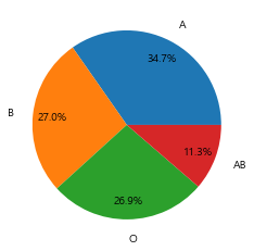
돌출효과 주기
plt.pie(personal,labels=blood_type,labeldistance=1.2,autopct='%.1f%%'
,pctdistance=0.8,explode=[0.1,0,0,0])
plt.show()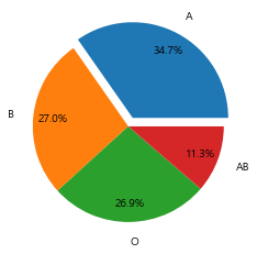
색변경하기
plt.pie(personal,labels=blood_type,labeldistance=1.2,autopct='%.1f%%'
,pctdistance=0.8,explode=[0.1,0,0,0],
colors=['lightcoral','gold','greenyellow','skyblue'])
plt.show()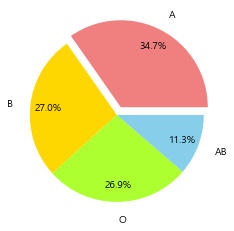
시작각도 변경
plt.pie(personal,labels=blood_type,labeldistance=1.2,autopct='%.1f%%'
,pctdistance=0.8,explode=[0.1,0,0,0],
colors=['lightcoral','gold','greenyellow','skyblue'],
startangle=90)
plt.show()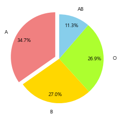
1.8 회전방향
counterclock=True/False
plt.pie(personal,labels=blood_type,labeldistance=1.2,autopct='%.1f%%'
,pctdistance=0.8,explode=[0.1,0,0,0],
colors=['lightcoral','gold','greenyellow','skyblue'],
startangle=90,
counterclock=False)
plt.show()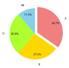
plt.pie(personal,labels=blood_type,labeldistance=1.2,autopct='%.1f%%'
,pctdistance=0.8,explode=[0.1,0,0,0],
colors=['lightcoral','gold','greenyellow','skyblue'],
startangle=90,
counterclock=False)
plt.legend(loc=(1,0.5))
plt.show()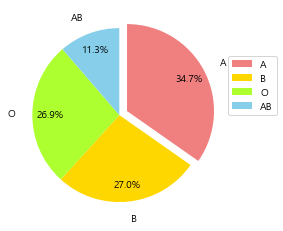
크기 변경
plt.pie(personal,labels=blood_type,labeldistance=1.2,autopct='%.1f%%'
,pctdistance=0.8,explode=[0.1,0,0,0],
colors=['lightcoral','gold','greenyellow','skyblue'],
startangle=90,
counterclock=False,
radius=0.5)
plt.legend(loc=(1,0.5))
plt.show()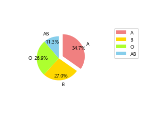
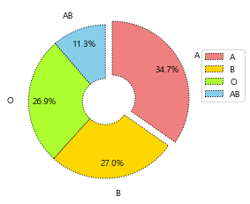
부채꼴 스타일
plt.pie(personal,labels=blood_type,labeldistance=1.2,autopct='%.1f%%'
,pctdistance=0.8,explode=[0.1,0,0,0],
colors=['lightcoral','gold','greenyellow','skyblue'],
startangle=90,
counterclock=False,
radius=1,
wedgeprops={'ec':'k','lw':1,'ls':':','width':0.7})
plt.legend(loc=(1,0.5))
plt.show()
폰트지정
textprops={'fontsize:폰트사이즈, 'color':폰트컬러,'rotation':폰트회전각도}
plt.pie(personal,labels=blood_type,labeldistance=1.2,autopct='%.1f%%'
,pctdistance=0.8,explode=[0.1,0,0,0],
colors=['lightcoral','gold','greenyellow','skyblue'],
startangle=90,
counterclock=False,
radius=1,
wedgeprops={'ec':'k','lw':1,'ls':':','width':0.7},
textprops={'fontsize':15, 'color':'b','rotation':45})
plt.legend(loc=(1,0.5))
plt.show()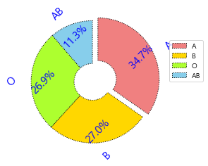
plt.figure(figsize=(5,5),facecolor='ivory',edgecolor='gray',linewidth=2)
plt.pie(personal,labels=blood_type,labeldistance=1.2,autopct='%.1f%%'
,pctdistance=0.8,explode=[0.1,0,0,0],
colors=['lightcoral','gold','greenyellow','skyblue'],
startangle=90,
counterclock=False,
radius=1,
wedgeprops={'ec':'k','lw':1,'ls':':','width':0.7},
textprops={'fontsize':15, 'color':'b','rotation':45})
plt.title('2019년 병역판정검사 - 혈액형분포',size=15)
plt.legend(loc=(1,0.5))

plt.show()
plt.figure(figsize=(5,5),facecolor='ivory',edgecolor='gray',linewidth=2)
'새싹 > 새싹 데이터시각화' 카테고리의 다른 글
| 7. 서울시 연간 기온변화 분석 및 시각화 (0) | 2022.07.29 |
|---|---|
| 6. seaborn-막대그래프 (0) | 2022.07.19 |
| 5. 그래프 스타일 고급 설정 (0) | 2022.07.15 |
| 2. 서브플롯 그리기 (0) | 2022.07.07 |
| 1강 그래프 스타일링 (0) | 2022.07.07 |
- Total
- Today
- Yesterday
- 여인권
- 인프런
- 인지부조화
- 심리학
- C
- 통계
- Python
- 뇌와행동의기초
- 통계학
- 일문따
- 데이터분석
- 류근관
- 보세사
- 파이썬
- 일본어문법무작정따라하기
- jlpt
- C/C++
- 사회심리학
- K-MOOC
- 코딩테스트
- 열혈프로그래밍
- stl
- 티스토리챌린지
- 강화학습
- 일본어
- c++
- 윤성우
- 회계
- 오블완
- 백준
| 일 | 월 | 화 | 수 | 목 | 금 | 토 |
|---|---|---|---|---|---|---|
| 1 | 2 | 3 | 4 | 5 | ||
| 6 | 7 | 8 | 9 | 10 | 11 | 12 |
| 13 | 14 | 15 | 16 | 17 | 18 | 19 |
| 20 | 21 | 22 | 23 | 24 | 25 | 26 |
| 27 | 28 | 29 | 30 |